AP Comparison & Market Share
Each year, Preseem issues the ISP Network Report, a free overview of the industry that’s full of exclusive data, analysis, and metrics for fixed wireless operators.
The report gives ISPs an independent source to compare their performance against the wider broadband ecosystem. It also helps others understand fixed wireless networks and emerging trends in the sector.
The ISP Network Report (formerly known as the Fixed Wireless Network Report) covers a wide range of topics, including subscriber data usage, access point metrics, RF channel width, oversubscription ratio, and lots more. We’ve already covered subscriber usage data and metrics in a previous blog, so this time we’ll turn our attention to AP Comparison and Market Share trends.
Preseem collects and utilizes many access point metrics when measuring and optimizing subscriber quality of experience (QoE) for our customers worldwide. In this blog, we’ll use those numbers to take a look at:
- Which vendors are gaining and conceding market share?
- What models achieve the best download and upload throughput?
- Who is delivering the best latency numbers during peak time?
- How do the top AP models compare on subscriber capacity?
AP Market Share
To understand the access point market share, we look at two metrics: the percentage of the fixed wireless market by the number of APs, and the percentage of the market by subscriber count. As you can see below, Cambium and Ubiquiti are the clear leaders for both access points and CPEs, with Cambium supporting a higher density on a lower number of APs.
Ubiquiti shows the largest growth year-over-year in Preseem’s subscriber market samples at 2.5%, but we can also see the rapid gains being made by Tarana in both markets, including the largest growth overall in the AP space.

As you might expect from the difference in AP market share by element and subscriber count, there’s significant variation in how many subscribers ISPs connect to individual access points.
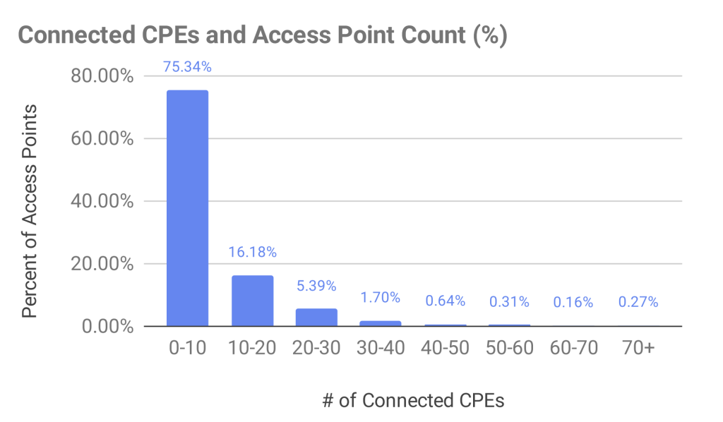
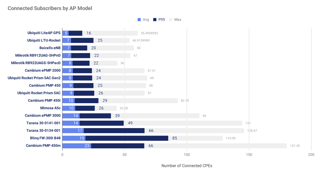
The chart below shows the number of APs bucketed by the number of subscriber radios connected to the access point. Surprisingly, the data shows that over 75% of access points have 0-10 subscribers attached, a 1.1% increase year over year. However, breaking this down by a few of the top AP models paints a different picture.


In the above chart, we can see that some AP models are typically deployed with many more subscribers than the overall average. In some cases, deploying with many subscribers has a negative impact on QoE, as we’ll see in the section on access point latency later in the blog.
Access Point Throughput
Since measuring throughput outside of peak times provides little insight into the subscriber experience—because the network isn’t loaded—the throughput numbers that follow were taken from the busiest times of the day for each individual access point.
The data shows that, in terms of the number of access points, 27% of deployed APs deliver less than 10 Mbps of real-world throughput, a 2.3% increase year-over-year. This is somewhat surprising, but looking at the more modern equipment shows a very different pattern.
Characterizing upload performance is more difficult because demand is often lower than what the network can handle. However, there are still some interesting insights to be gained. In particular, we found that almost all APs deliver less than 10 Mbps of upload throughput during the times of the day with the highest demand (download the report to see this chart!).
AP Latency
Across all access points, the distribution of latency follows an interesting pattern. Most APs deliver service with less than 100 ms of latency during peak times, but a significant number are over that benchmark. Latencies have improved since our last report, indicating that operators are upgrading their networks appropriately to keep up with rising demand. Nice job, everyone!
Latency requirements differ greatly by application. High latency has very little effect on Netflix, for example, but has a large impact on gaming. A simple point of comparison is Voice over Internet Protocol (VoIP). Typically, the end-to-end latency for a VoIP call needs to be less than 150 ms for the user to have a good experience.
Note: The values in our report represent the latency from Preseem to the subscriber and back and, as a result, do not include the rest of the path. Therefore, the values need to be lower than 150 ms to achieve a good VoIP experience. Overall, we’ve found that latency has improved steadily over time, largely driven by last-mile improvements.
Subscriber QoE is strongly affected by latency. The 5th percentile of latency is a good measure of the “best case” scenario, while the 80th percentile shows latency under load.

Access Point Capacity
Airtime, bandwidth, and latency are all important metrics to understand, but what really matters is the number of subscribers that an AP can handle while still delivering a good experience.
Determining the subscriber capacity of an access point is complex, requires deep knowledge, and often comes down to intuition built up through experience. Preseem solves this problem by building a global performance model for each access point and configuration, and combining it with a model of subscriber behavior unique to each service provider.
This answers the question of AP capacity in the simplest form possible—the available capacity in terms of subscribers. The chart below summarizes the subscriber capacity across all Preseem customers for some common access point models and channel widths. Many models operate best at 50-60% of the achievable efficiency. In the case of radios like the PMP 450M, adding more users actually increases the efficiency up to a point, due to increase in opportunities for MIMO transmission.

UPDATE: The Fixed Wireless Network Report is now called the ISP Network Report, and the latest edition includes metrics from fiber and hybrid ISPs for the first time. To access all of the charts and exclusive insights from the latest edition, click below to download your free copy.


