This blog is a part of a series about link quality and wireless service offerings. Read the previous blog in this series: Fixed Wireless Capacity Planning: Making Money From Thin Air.
Fixed Wireless Spectrum Bands
Fixed wireless spectrum bands vary in suitability and purpose, but they share common features. Understanding modulation and signal-to-noise ratio (SNR) is key to making the most of wireless capacity.
RF Horns of A Dilemma: Reach vs. Capacity
In the world of wireless transmission, we often have to settle for a compromise between reach and capacity.
Building our networks—access points, towers, and the backhauls between them—is a balancing act. If we build out too few tower locations, the median distance to our customers is too low to achieve competitive Internet speeds that attract and retain paying customers. But if we build too many towers for the population density we’re trying to cover, we’ll never achieve a healthy return on our investment.

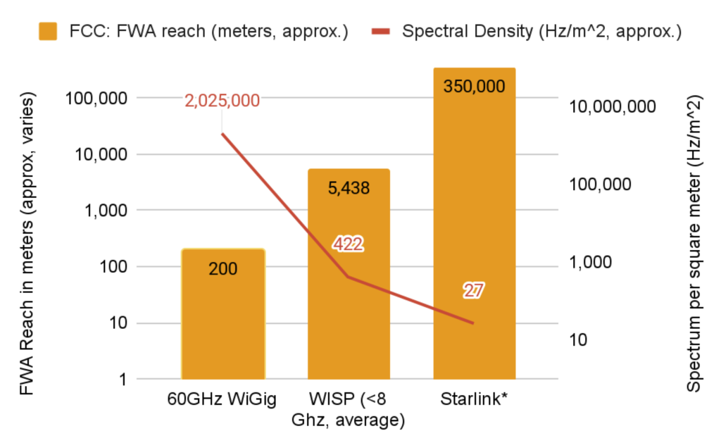
Illustration: Current fixed wireless spectrum bands with practical reach and spectral density
The chart above reveals several points of interest. Shown here in blue, reach is the practical line-of-sight distance a given frequency band can serve customers. In general, reach is inversely proportional to frequency. (The relationship is not entirely linear due to other factors like varying regulations and allowed maximum power levels.)
What’s Up With Fixed Wireless Spectrum Bands?
A mix of WISP frequencies is shown, both unlicensed and licensed. They roughly fall into three groups, the first group being TV White Spaces (TVWS), 900 Mhz, EBS and Auction 108, and CBRS.
The second group houses the original workhorses of WISP operations, 2.4 GHz, 5 GHz, and 6 GHz.
5 GHz comprises several sub-bands, but can for simple purposes be divided into low power, low-reach spectrum (DFS) versus higher power spectrum in 5.1 and 5.8 GHz.
The FCC has allocated a large chunk of 6 GHz for indoor and outdoor use. However, outdoor use won’t reach general availability until a system of safeguards is built to protect incumbent point-to-point operations in the band. Once this is in place, many WISPs will find a dramatic increase in how much spectrum is available to them. That is, approximately 3–4 times the amount of high-power spectrum available in 5 GHz today, not counting DFS.
Some fixed wireless and mobile providers have licensed frequencies that fit between 7 GHz and 60 GHz. These are omitted here due to their inaccessibility to most small WISPs.
In a class entirely by itself is 60 GHz (and other milliwave frequencies). Milliwave frequencies are marked by strict line-of-sight requirements (no partial obstruction allowed) but with a great trade-off—significantly higher spectral capacity.
The red line on the graph is spectral density. For a given spectral band, we’re approximating how much spectrum is available for a single typical coverage (one access point, spot beam or RF chain in MIMO, or its equivalent in multi-AP hardware). Consequently, we have an inverse relationship between reach and capacity.
Vendors will vary in spectral efficiency based on several advanced techniques. We are here concerning ourselves solely with theoretical spectrum capacity, not comparing vendor to vendor.
Serving customers with fixed wireless is a balancing act. Investment in an area must take subscriber density, spectral availability, and also intra-tower distance into account to perfectly optimize buildout. Without careful analysis, it’s possible to build out a network where the density of APs doesn’t match the density of subscriber demand.
While Preseem doesn’t track ROI per tower at this time, we can provide some guidance on what vendor solutions are best adapted for a particular subscriber density.
Starlink: Endgame or Game Changer?

Illustration: Starlink reach and density compared to traditional and new fixed wireless (WISP frequency) spectrum bands
Many WISPs are naturally concerned about competition from Starlink. We don’t yet know the ultimate limit of Starlink’s frequency reuse. This is because their plan is to have many small satellites moving continuously overhead at each point of the globe.
However, all else being equal, we can determine that the theoretical capacity of the final system will be a function of how large the spot beams that cover the earth need to be.
Based on current public data, the achievable spectral density is approximately an order of magnitude lower for Starlink than for the typical WISP in 3 and 5 GHz. In addition, the relatively high free space path loss (compared to terrestrial fixed wireless) dictates low modulation schemes. No matter how much frequency reuse occurs, low modulation will further limit the ultimate system capacity. Starlink’s primary advantage over WISPs is that the reach is essentially unlimited, assuming no trees or terrain act as obstacles.
Therefore, Starlink will be most cost-effective where WISPs don’t have an adequate return on investment today. These areas also tend to have lower population density and/or higher middle-mile costs.
TL;DR Starlink’s final capacity is unknown; reach is the stand-out feature and also the limiting factor.
Reach and Modulation
Transferring data using a network always requires a physical medium. Copper wires for DSL, coaxial cables, and Ethernet wiring are examples of electrical signals carried over a physical wire. Optical fibers use non-visible wavelengths of light.
Wi-Fi, mobile and fixed broadband, and satellite are examples of wireless transmission. That is, radio waves in free space, largely unobstructed by anything but air and water vapor.
Modulation schemes map digital values (zeroes and ones) onto an unreliable medium. The animation above shows some common modulations in use in fixed wireless.
The higher the modulation scheme in use, the “faster” the resulting communication channel. It takes less time to send and receive a given payload of data. Also, using less airtime frees the channel up for additional data or other users.
The real-world distance between the transmitter and receiver is one of the best predictors in determining how high a modulation scheme can be achieved. As an example, see this distance chart for legacy Wi-Fi. We observe both the effect of different spectrum bands on reach (2.4 GHz goes further than 5 GHz but at less capacity) and of distance on capacity.

Illustration: 802.11a/b/g Wi-Fi: relative distance and speed chart (source)
Signal to Noise = Capacity
Here’s a visual analogy for what happens decoding a given modulation scheme. Unless noise is low and signal is good, the data is hard to read accurately.
In the animation above, we illustrated one way to raise the “readability” of the signal—we increased the typeface size. This is the equivalent of stepping down to a lower modulation level. Stepping down to a lower modulation also increases contrast because of the resulting increase in output power per symbol.
The amount of energy and power used in the entire frame has a cap or ceiling. Therefore, using fewer symbols per frame at lower modulation levels allows the contrast between the noise and the symbol to rise. This improves SNR, lowering the error rate, but also lowers the throughput.

Illustration: Reading a wireless frame of data—a simulated study in visual contrast.
The Hidden Cost of Spending Too Little on SNR
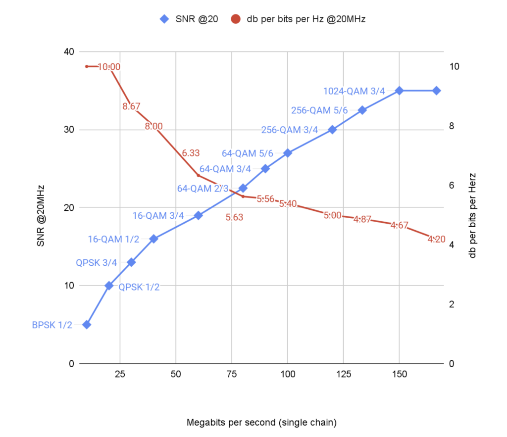
There is a hidden cost in spending too little to connect a subscriber. Take a look at this graph of a generic single-chain 802.11ax radio system. Real-world implementation efficiencies, when compared apples to apples, vary only slightly by hardware vendor. The insights from this graph also apply to earlier versions of 802.11 and other systems subject to Shannon limits.
Vendors vary in their ability to provide multiple simultaneous streams (MIMO) and other carrier enhancements that increase total system capacity. We are here concerned purely with individual chain capacity. The principles will hold while the numbers will change.

Illustration: Wi-Fi SNR, efficiency, and modulation cost


