RF Channel Width: ISP Network Report
Each year, Preseem issues the ISP Network Report, a free overview of the industry packed with exclusive data, analysis, and metrics for fixed wireless and hybrid operators.
The report provides ISPs with an independent source to compare their performance against other operators. It also helps others understand fixed wireless networks and emerging trends in the sector.
The ISP Network Report covers a wide range of topics, including subscriber data usage, access point metrics, AP performance by vendor, and lots more. In previous blogs, we’ve already covered subscriber data usage and metrics, as well as AP comparison and market share trends, so for the final blog in our series, we’ll turn our attention to RF Channel Width and its effect on network quality of experience (QoE).
Besides obvious items like the location and AP model, the choice of channel width is one of the more important decisions that needs to be made for every site. In this blog, we’ll look at what channel widths are used and how that impacts the network and subscriber experience.
What RF Channel Width is Most Common?
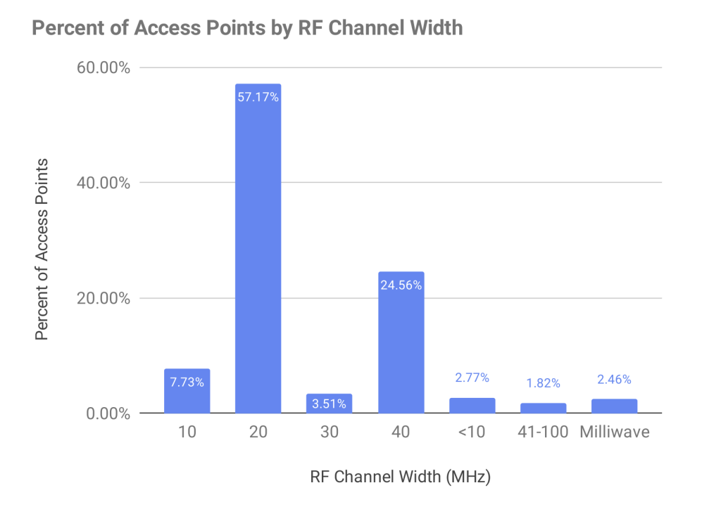
Across all of the access points that Preseem monitors across our customer base, 57% use 20 MHz channels (a 1.7% decrease year-over-year), with 40 MHz and 10 MHz channels the next most common. Wider channels are on the rise—milliwave has increased almost a full market percentage point since 2022—while a small percentage of channels are narrower than 10 MHz.

Download Rate by Channel Width
By looking at all APs aggregated by channel width, we can see that a larger channel width increases throughput, but the effect is not always equal to the increase in channel size. Larger channel sizes are growing in popularity but are not as fully utilized. These will show more potential as airtime consumption increases.
Download the report to see the accompanying graph showing throughput in Mbps by each RF channel width.
Connected CPE Radios by Channel Width
The following chart shows the number of connected customer premise equipment radios (CPEs) by channel width across all access point models.
Milliwave radios are on the rise. They use very large channel widths, but average very few connections per radio due to the short distances required. Milliwave has an effective range of just hundreds of feet, but delivers very high capacity.

Checking past editions of the Fixed Wireless Network Report, we can see that 20, 40 and 80 MHz channels have all dropped 1 client at P80 (the 80th percentile) since 2022. This is expected for good QoE as client usage grows.
Subscriber Throughput by RF Channel Width
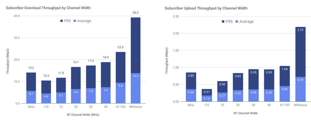
Of course, the number of connected subscribers is only part of the picture, as it doesn’t relate perfectly to the subscriber experience. The next two charts show the typical per-subscriber download and upload throughput by channel width. The results show little increase in either download or upload throughput across channel widths. This suggests that ISPs use wider channels to handle more subscribers instead of delivering higher per-subscriber throughput.
APs by Oversubscription Ratio
As a bonus item for this blog, let’s take a look at oversubscription ratio as this can also affect QoE. In most networks, some amount of oversubscription is normal. For example, a wiring closet switch may have twenty 1G ports with a single 10G port to the core network. This results in a 2:1 (sum of port rates/uplink port rate) oversubscription ratio.
Internet provider networks are no different in this regard. No ISP can afford to provision enough bandwidth from the edge to the transit point for every subscriber to use their entire plan rate at the same time. The business model simply doesn’t work.
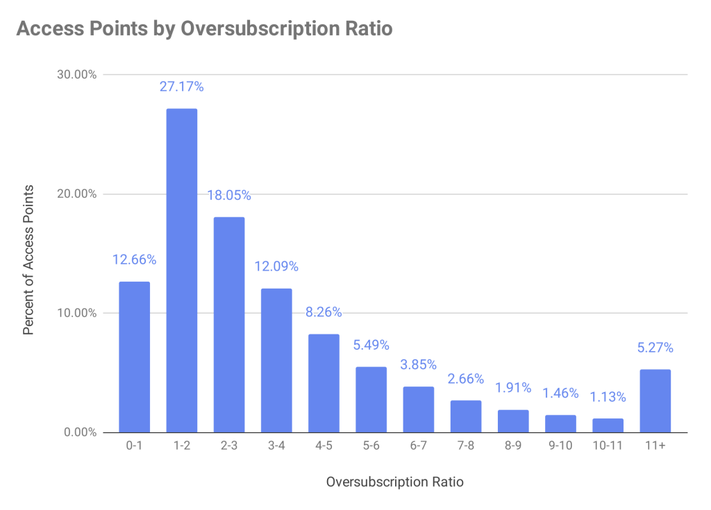
The next chart provides some insight into how much ISPs oversubscribe their wireless access networks. The formula used to calculate oversubscription is simply: Sum of subscriber plan rates on AP/typical throughput for that AP model and channel width. For example, if an ISP has sold twenty 10 Mbps plans on an AP that typically achieves 50 Mbps, then the oversubscription ratio is: 20 * 10 / 50 = 4.

This chart shows that 57% of APs are under three times oversubscribed. Oversubscription in and of itself is not bad. However, higher oversubscription ratios generally lead to lower subscriber throughput during peak, and therefore a poorer subscriber experience.
UPDATE: The Fixed Wireless Network Report is now called the ISP Network Report, and the latest edition includes metrics from fiber and hybrid ISPs for the first time. To access all of the charts and exclusive insights from the latest edition, click below to download your free copy.


