How to Use Network Metrics to Deliver Business Value
At WISPAPALOOZA 2024 in Las Vegas this October, Preseem co-founder and CTO Scot Loach delivered a presentation called Analyzing Network Data.
This video is a re-recording of that session and focuses on four different techniques for analyzing network data—trending, adding context, benchmarking, and scoring. Using real network data to demonstrate each technique, Scot shows how metrics can build on each other to produce tangible results that regional ISPs can use to improve network operations, increase efficiency, and drive revenue growth. The following is a summary of the presentation.
Trending
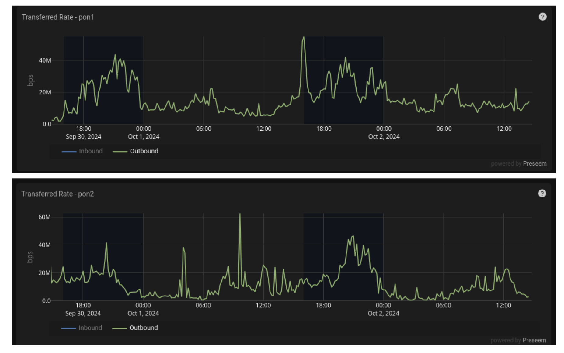
Trending means looking at data over a period of time to identify patterns. As an example, Scot shows bitrate-over-time data from a fiber network to see where this ISP should consider adding capacity.

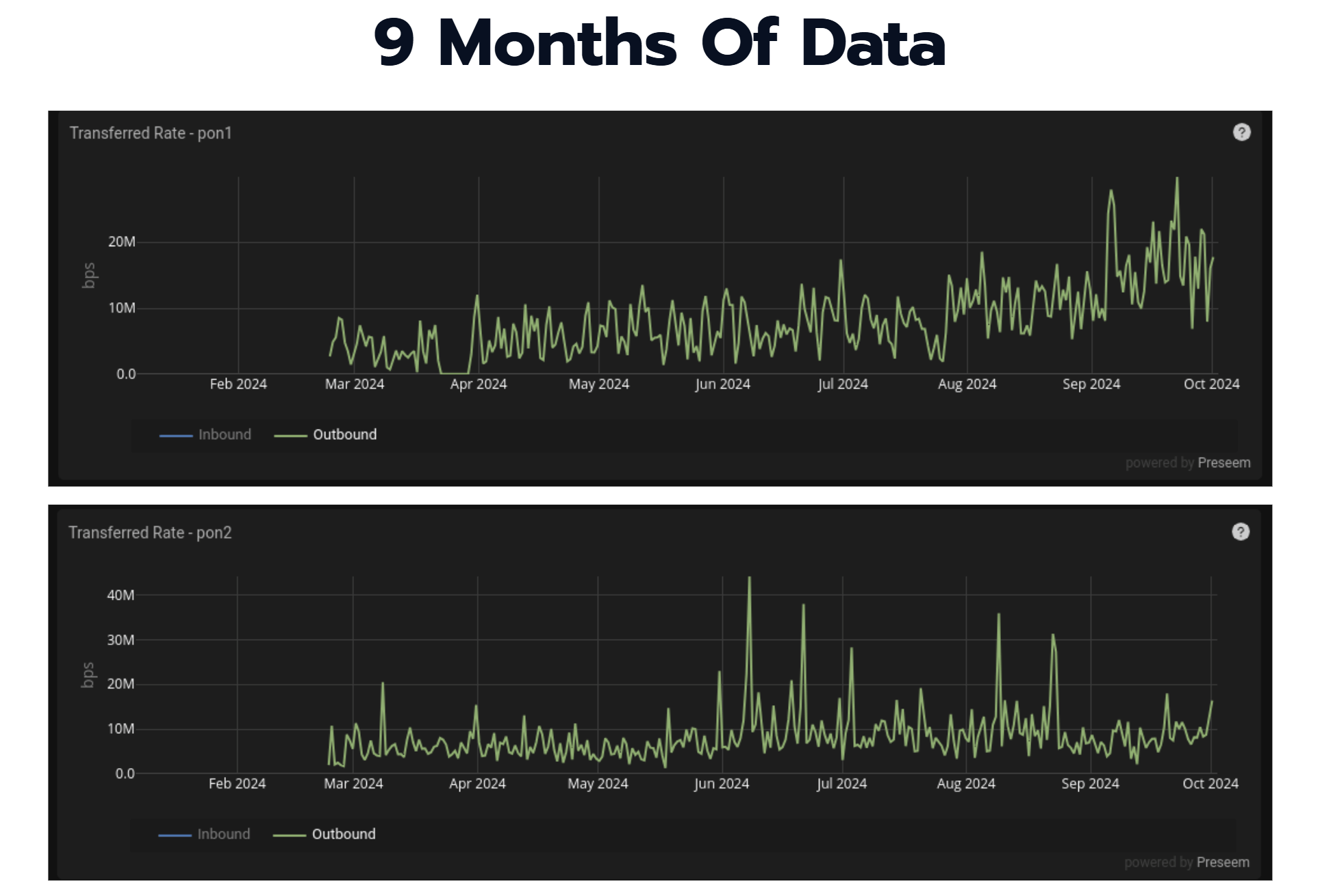
The image above shows data from two PON ports on an OLT over a period of a few days. However, as Scot points out, this timeframe is not really sufficient to draw conclusions that will ultimately affect an entire network. Zooming out, Scot shows the data over a month and then a nine-month span.

With a longer timeframe, trends become more easier to spot. In this case, we can see that the top PON is growing, while PON 2 remains relatively flat in comparison. As a result, it’s clear that investing in PON 1 will be a better use of funds to create more capacity on the network.
Trending helps ISPs see patterns that can help them take a more proactive approach to network operations and encourages better decision making. When evaluating vendor tools, make sure you can store a year or two of data history to allow you to easily see long-term trends. The longer the time horizon, the more valuable the data is for decision making.
Adding Context
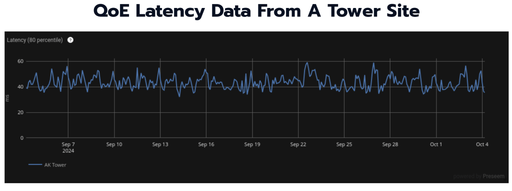
Adding context means joining data from different sources together and then grouping the data to reveal greater insights about your network. For this technique, Scot showed an example of QoE latency data from a tower site on a fixed wireless network.

The example shown is taken from Preseem, where latency is measured between a QoE appliance and the end user devices for all subscribers served by that tower. Even though the timeframe shown here is about a month, this data is not really indicative of what’s going on on the network. Adding context, however, can provide greater insight.
To do this, Scot showed how this data looks when adding the Access Points that each latency sample in this data set transited, and then grouping the results by AP.

This gives us something a little more interesting. We can see above that, while most of the APs are clustered down around 40ms of latency, there’s one access point that’s averaging between 100-150ms. As a result, we’re able to pinpoint the problematic AP and address any issues there, rather than wasting time investigating other APs that are not causing any issues.
When adding context, Scot points out that there’s a couple of key issues to always consider—is the context useful and actionable, and is the source of data for that context an accurate source of truth?
Benchmarking Network Data
Now that you’re tracking trends and adding context to your data, how do you know whether what you’re seeing is good, bad, or somewhere in between? That’s where benchmarking comes in.
Benchmarking is simply comparing your data against similar situations or against standard data. Using the high-latency access point from the Context example above, Scot shows how to use benchmarks to understand if this is really a problem and, if so, what can be done to fix it.

Looking at the data from the problem AP, Scot points out a few areas that could be indicative of the problem, such as MCS Downlink/Uplink or Downlink Capacity, but they don’t provide a definitive diagnosis on their own.
Scot then showed the same chart for a different access point, but found that it was difficult to tell whether any of the metrics shown above were exposing a problem. This is where the other techniques we’ve mentioned become useful, such as looking at trends over time between access points.
Taking it one step further, Scot shows how to use Preseem to compare the high-latency AP against an industry-wide benchmark. This can help explain whether the access point with high latency is really a problem or not. Based on the investigation above, we know why this AP has high latency, but is this really bad or is it just “worse” than the other access points on the tower and not actually an issue for the network?

The AP in this case is an ePMP 3000 at 40 MHz. Preseem shows that this AP is indeed well above the benchmark of around 50ms for similarly-configured models monitored in the system. This gives us definitive proof that something is up with the access point and needs to be addressed.
Benchmarking is a powerful tool for making your network data useful in a proactive way, and can be used to understand precisely where to focus your network troubleshooting efforts.
Scoring
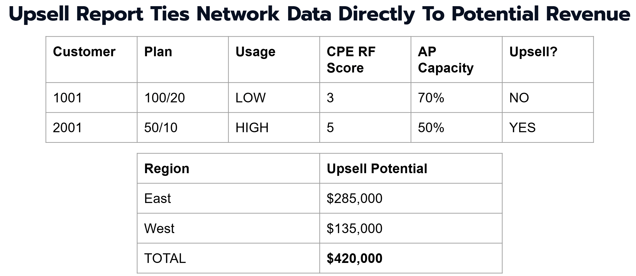
When it comes to network data, scoring refers to taking a set of entities, like subscribers, adding context to them, and then assigning a value or rank to evaluate performance or some potential action.
In this example, Scot shows how data can be tied directly to revenue and profit. By viewing each customer, their plan and usage rates, and bringing in their CPE RF Score and AP Capacity numbers from Preseem, we can see which subscribers are the best bet for upsell activities without having to spend on network upgrades, adding new APs, etc.

This data can then be used to plan, for example, a sales campaign to upsell a specific number of subscribers and drive revenue growth in an efficient way.
If you’re interested in learning more about how to use data to improve your network operations and subscriber quality of experience, watch Scot’s full video below or check out our product tours.


